What I’ve Learned as a Visitor, Educator, and Museum Curator
I’ve walked through museums as both a teacher and a curious wanderer. When I taught in public schools, I saw firsthand how the way knowledge is delivered can either light up a classroom or make students shut down.
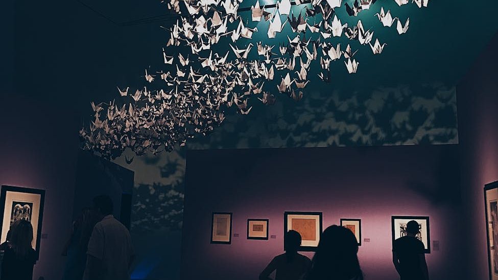
That same truth applies inside museum walls. A gallery can feel alive, inviting you to lean closer, or it can feel flat and distant, leaving you with little more than a glance.
Now, as I build ILA Institute and begin experimenting with videos about learning while wandering through museums, I pay attention to not just what’s displayed, but how it’s shared. Some approaches open the door wide for visitors. Others unintentionally close it.
This is my attempt to name those patterns—the DOs and DON’Ts of presenting knowledge in museums—from the perspective of someone who’s always learning, always watching, and always asking what makes knowledge stick.
From my notes app as I walked through several LA museums, then organized with the help of ChatGPT, here is the list:
Sound & Media
- DON’T play movies on loop with sound filling the space.
DO use subtitles or provide headphones/telephone handsets for audio. - DON’T have long movies without seating; give guests a button to press if they want to watch, and provide chairs.
- DO play subtle background (classical or ambient) music to set the tone.
DON’T let sound bleed into other areas. - DO offer audio tours or soundtracks that visitors can listen to on their own devices.
- DON’T only offer audio snippets where the visitor has to punch in the numbers associated with the pieces. Tours should be offered that are continuous. I would rather listen to an hour long track that guides me around the museum than have to pull out my phone every 2 mins to punch in a new number.
Interactivity & Engagement
- DO include objects that can be touched!
- DO add fun, light games to keep engagement high.
- DO host community events and engagement opportunities.
- DO create “Night at the Museum” programs for a special experience.
- DO launch new exhibits with opening parties.
- DO have QR codes for opportunities to learn more.
- DON’T forget to incorporate technology (screens, projectors, lighting, etc..)
- DON’T close off research rooms from the public.
- DO share archival materials, books, and research sources when possible.
Exhibits & Content
- DON’T forget to give information on the curators and the curating process behind the exhibits.
- DO have an exhibit (even if it’s really small) about the history of the museum and its why
- DO highlight the historical, cultural, and social significance of pieces.
- DON’T overcrowd glass cases with too many items and minimal labels.
- DO share the significance of the building that houses the museum.
- DON’T put up long blocks of text; space them out and keep them digestible.
- DO use collages, booklets, and flip-through materials to share more information.
- DO share behind-the-scenes content (curation, research, fieldwork, process).
- DON’T display content that doesn’t align with the museum’s mission (unless clearly contextualized).
- DO use storytelling as your primary mode of knowledge-sharing.
- DO be transparent about where artifacts come from and honor the source communities.
- DO tackle difficult topics and be inclusive in representation.
- DON’T forget to credit curators.
- DON’T forget to explain the curating process.
- DO offer exhibits and activities specifically for kids.
- DO have yearbooks from local high schools,
- a hall of fame (featuring famous people connected to the area),
- and information about the founders
- and key figures whose names are familiar to residents (such as street names, schools, etc.),
- if you are a city preservation museum.
Layout & Flow
- DON’T scatter multiple entrances and exits; keep one clear entrance and one exit.
- DO use signage to guide visitors and create flow.
- DON’T leave rooms underused; maximize creative use of all spaces—even staircases.
- DO invest in movable walls or mesh walls to reconfigure space.
- DON’T have dark rooms without lights or signs.
- DO create a one-way path for visitors to see all exhibits.
- DON’T block off exhibits/oeuvres with ropes.
DO use subtle barriers like sandpaper flooring to signal boundaries. - DO add social media/photo opportunities throughout.
- DO put art near elevators and staircases to keep the experience seamless.
- DON’T have large empty lobbies—fill space with exhibits and just keep a check-in table.
- DON’T have white walls. They get dirty quickly. Use a deep color instead.
- DON’T neglect building and exhibit maintenance, including bathrooms.
Visitor Services
- DO give visitors a map of the museum.
- DO have a small 3-question survey for feedback and improvement.
- DON’T ignore guest feedback—use it!
- DO provide flyers for announcements of temporary exhibits.
- DO have a space for local events and local businesses to add their cards/flyers to promote community.
- DO offer a gift shop.
- DON’T post “Do Not Touch” signs everywhere—use glass cases where needed or an image of a hand pointing with a line through it.
- DO provide comfortable and clean restrooms that stay open until closing; not a half hour before.
- DON’T have guards pacing the floor aimlessly.
- DO assign one guard per room/section. Have them study the paintings in that room. Rotate frequently.
- DO have staff trained to answer questions about the museum and its collections.
That’s what I have so far. Let me know if you agreed/disagreed with any of these points.
I’ll keep sharing what I notice, both as an educator and as someone who genuinely loves wandering museums and learning from them.
If you’ve found these DOs and DON’Ts helpful, I invite you to subscribe—I’ll be posting more reflections, guides, and ideas on how we can make learning in public spaces richer, more welcoming, and more engaging for everyone.
FOR MORE FROM ILA INSTITUTE

Leave a reply to TODAY AT THE ORNELIAN (9/24/25) – THE ORNELIAN Cancel reply